Creating a dynamic radial ripple effect on hover with CSS/JS
We show you how to implement a clean and reusable Material ripple effect using CSS radial-gradient and a tiny bit of JS.

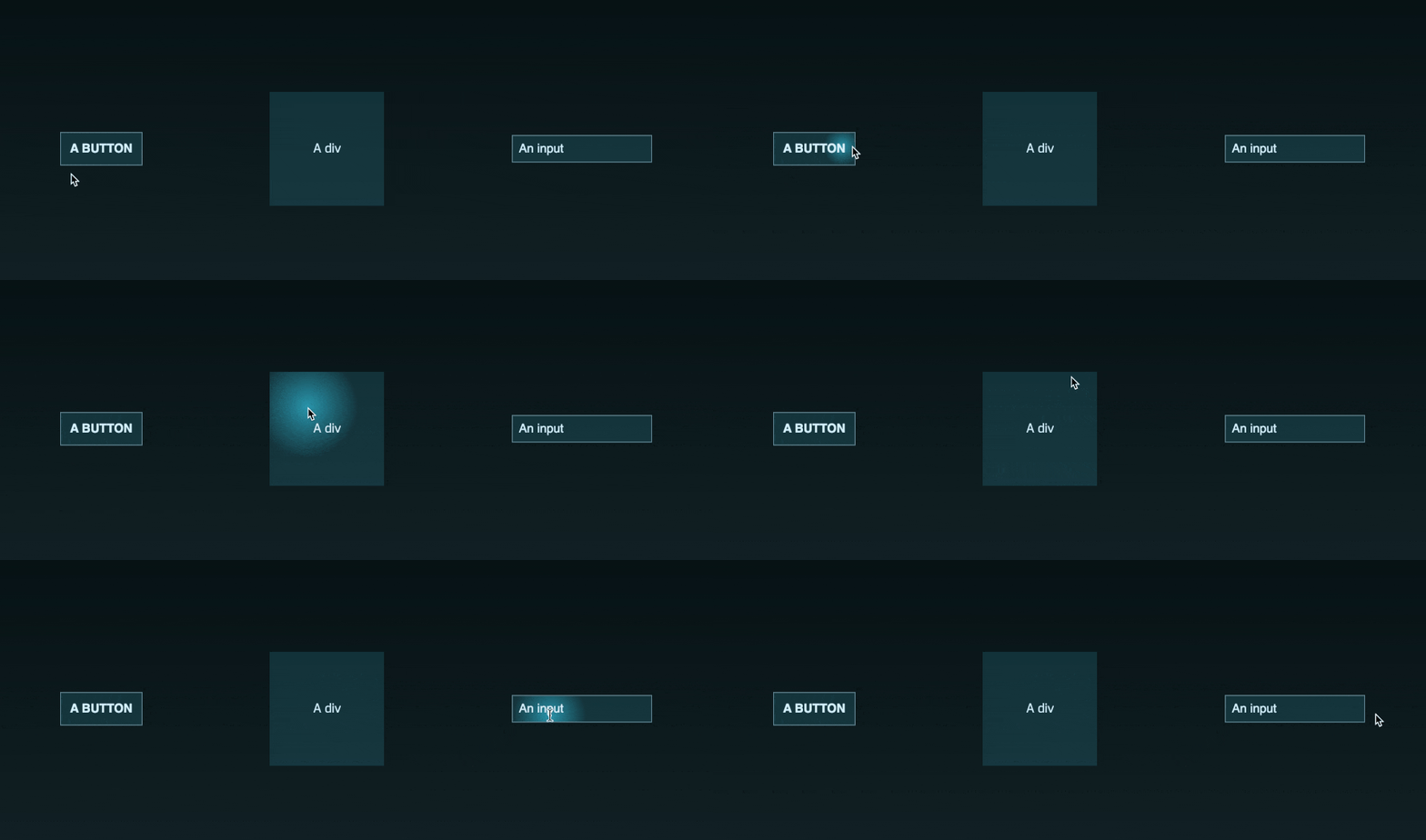
You probably know the so-called ripple effect used in Material design: The idea is to take the position where you clicked an element and to cast a circle out from that point - which gives the user great visual feedback.
If you have been searching for ways to implement this effect on hover instead of click, you have probably found some rather dirty solutions that either add temporary elements like span tags or pseudo elements to the DOM, only work in containers with position: relative, or don’t interact well with Flexbox.
Implementation
We came up with a much cleaner way to achieve the desired result that uses the CSS radial-gradient() function. By definition,
it creates an image consisting of a progressive transition between two or more colors that radiate from an origin.
Well, doesn’t that sound just like what we’re after? Turns out it does!
We start with the most simple HTML for a button:
<button>This is shiny!</button>Now we add some minimalistic CSS love to it:
:root {
	--bg-color: rgba(46, 161, 182, 0.25);
	--ripple-color: #2ea1b6;
}

button {
	background-color: var(--bg-color);
	/* these are just eye-candy and not required: */
	color: #dcf3ff;
	border: 1px solid #6e92a0;
	padding: 12px;
}
We define two CSS variables for the background and the desired ripple color of the button. You might wonder where var(--ripple-color) is used which brings us to the last piece of the puzzle:
// Please don't do that at home. Or work...
const button = document.getElementsByTagName("button")[0];

button.addEventListener("mousemove", (e) => {
  const rect = button.getBoundingClientRect();
  const x = ((e.clientX - rect.left) / button.clientWidth) * 100;
  const y = ((e.clientY - rect.top) / button.clientHeight) * 100;

  button.style.background = `radial-gradient(circle closest-corner
    at ${x}% ${y}%,
    var(--ripple-color), var(--bg-color))`;
});

button.addEventListener("mouseleave", (event) => {
  button.style.removeProperty("background");
});
First, we get hold of our button in JavaScript. Then we listen to the mousemove event which triggers whenever we move the mouse cursor over it - so basically :hover in JS. Note that this function will trigger a lot, so don’t do anything crazy in there.
We just calculate the relative position of our cursor within the element as percentage. We can then use this to set the starting point of our gradient using its very handy at [x y] syntax that even supports percentages.
Besides that, we also define the gradient color which is the before-mentioned var(--ripple-color) flowing towards the var(--bg-color) of our button. You can go really crazy here and add more gradient stops if you’d like to.
CSS radial-gradient() supports two different shapes: circle and ellipsis. Because radial gradients are technically images, you could also use your own SVG as shape but we won’t cover this here.
The last parameter is the size of the gradient’s ending shape. This can be provided explicitely or with four different keywords. In our case, we wanted the cursor to appear like a spotlight on the surface of the button and closest-corner is good enough for us to achieve this effect. Again, the possibilities here are endless and you can define your own sizing logic using explicit measurements.
Review
The featured implementation is pretty slick and has different advantages:
- no DOM overhead or fake elements required
- very little and unobtrusive code without external dependencies
- performance: JS calculation is trivial and the effect itself is rendered using CSS-only
- customizable gradient effect
- can be applied to every DOM element supporting the CSS
backgroundproperty
Here is a playground demonstrating the last point:
Bonus: Angular directive
In Angular, you can further simplify the usage of the ripple effect by defining the JS code as attribute directive that can be attached to any DOM element - much like the ripple used in Google’s Material library. Doing that will eliminate the need for a CSS class on the element and in addition we no longer need extra code to find all rippleble (is this even a word?) targets in JavaScript:
import { Directive, HostListener, Input } from '@angular/core';

@Directive({
	selector: '[appRipple]'
})
export class RippleDirective {
	// if you'd like set these in JS instead of CSS:
	@Input() bgColor = 'var(--bg-color)';
	@Input() rippleColor = 'var(--ripple-color)';

	@HostListener('mousemove', ['$event'])
	createRipple(event: MouseEvent) {
		const elem = event.target as HTMLElement;
		const rect = elem.getBoundingClientRect();
		const x = ((event.clientX - rect.left) / elem.clientWidth) * 100;
		const y = ((event.clientY - rect.top) / elem.clientHeight) * 100;

		elem.style.background = `radial-gradient(circle closest-corner at ${x}% ${y}%,
      ${this.rippleColor}, ${this.bgColor})`;
	}

	@HostListener('mouseleave', ['$event'])
	removeRipple(event: MouseEvent) {
		const elem = event.target as HTMLElement;
		elem.style.removeProperty('background');
	}
}
To apply the directive HTML, just use:
<button appRipple></button>
<div appRipple></div>
Thanks to the awesome Annika Tepper for both the inspiration and design of the button and effect.
Let the rippling begin!


